Part of: Banknote Types & Materials
Exploring different types of banknotes, their materials, design principles, and the factors that influence their visual appearance, functionality, and security across different currencies worldwide.
Banknote colors serve multiple critical functions beyond aesthetics. Currency designers worldwide use color as a primary tool for quick denomination identification, accessibility support, and counterfeiting prevention. Understanding why banknotes have different colors reveals the careful balance between practical usability, security requirements, and inclusive design principles that central banks consider when developing currency systems.
Modern banknotes use distinct color schemes to help people instantly recognize denominations without reading numbers. This visual system works across language barriers and helps those with visual impairments navigate currency transactions. Global statistics suggest that approximately 23% of banknote colors worldwide are green, 18% yellow, 17% grey, and 14% blue according to available surveys, with significant variation based on regional design traditions and security considerations that differ by country and currency system.
The choice of banknote colors involves complex decision-making by central banks, considering factors from psychology and culture to printing technology and accessibility standards. Understanding security features and design principles helps explain how color choices contribute to both usability and fraud prevention. This article explains the principles behind banknote color selection and how different countries approach this fundamental aspect of currency design.

Why Banknote Colors Differ by Denomination
Color differentiation in banknotes serves as the primary quick-identification system for currency users worldwide. When you reach into your wallet, color helps you instantly distinguish a high-value note from a low-value one without needing to read the denomination number. This speed matters in everyday transactions, particularly in busy retail environments where rapid payment processing is essential.
Central banks assign different colors to denominations based on several practical considerations. Higher denominations typically receive warmer colors like red, orange, or yellow in many currency systems, while lower denominations often use cooler tones like blue, green, or grey. This pattern helps create an intuitive visual hierarchy, though significant exceptions exist based on cultural preferences and historical precedent in different monetary systems.
The United States stands as a notable exception to global color variation practices. US dollars maintain their distinctive green color across all denominations, earning the nickname «greenbacks.» This monochrome approach dates to the 1860s when the government began printing paper money using green ink, which was readily available, difficult to photograph for counterfeiting purposes, and became associated with monetary stability. While the US has added subtle color variations since 2003, the dominant green remains a cultural identifier that distinguishes American currency globally.
Historical Evolution of Banknote Colors
Early paper money, first developed in China around 650 AD, was printed in black ink on white or light-colored paper. When European countries began issuing banknotes in the 17th and 18th centuries, they initially followed similar monochrome patterns. Switzerland introduced some of the first European banknotes in 1825, printed entirely in black and white without color differentiation.
The shift toward colored banknotes accelerated in the 1850s and 1860s as printing technology advanced. Colored inks provided an additional security feature against counterfeiting, as color reproduction was technically challenging for potential counterfeiters using period technology. By the early 20th century, most major currencies had adopted multi-color designs, with different denominations receiving distinct color schemes to aid recognition and prevent fraud.
The Science Behind Color Selection
Currency designers use principles from color theory and psychology when selecting banknote colors. The color wheel guides many decisions, with designers often choosing colors that are maximally distinct from each other to prevent confusion between denominations even in challenging viewing conditions.
For example, if a low denomination uses blue, a mid-range denomination might use orange (blue’s complementary color on the color wheel), and a high denomination might use green. This spacing across the color spectrum ensures that even in poor lighting conditions or when handled quickly during transactions, the denominations remain visually distinct and unlikely to be confused with one another.
Color Psychology in Currency Design
Different colors evoke specific psychological responses that currency designers consider when making color selections. Blue typically conveys trust, stability, and authority, making it a popular choice for mid-range denominations across many currency systems. Green suggests growth, prosperity, and balance, which helps explain its dominance in US currency and presence in many other monetary systems worldwide.
Red and orange create associations with energy, wealth, and importance, often reserved for higher denominations that warrant psychological signals of greater value. Yellow communicates optimism and value but requires careful use due to visibility challenges on white backgrounds that could affect readability. Purple and violet, historically associated with royalty and rarity, appear in only about 10% of banknotes globally according to available surveys, often marking the highest denominations.
Cultural factors also influence color choices significantly. In some Asian currencies, red holds particularly positive associations with prosperity and good fortune rooted in cultural traditions. European currencies often favor blues and greens for their professional appearance and widespread cultural acceptance across diverse populations using the currency.
Security Features and Banknote Colors
Color serves important security functions beyond basic identification in modern currency systems. Modern banknotes incorporate color-shifting inks that change hue when tilted, creating a dynamic security feature difficult for counterfeiters to reproduce accurately. These inks might shift from copper to green, purple to blue, or gold to green depending on viewing angle and lighting conditions.
Multi-color printing itself acts as a security measure against counterfeiting. Banknotes typically use offset printing with multiple ink passes, creating complex color interactions that simple photocopiers or scanners cannot accurately reproduce. The subtle color gradients, called rainbow printing, require sophisticated equipment to replicate, making them effective deterrents against casual counterfeiting attempts.
According to the European Central Bank, color consistency across production batches is monitored to strict standards in legitimate currency production. Even slight color variations from official specifications can indicate potential counterfeits, making precise color matching a key authentication method for currency verification systems used by banks and retailers.
Banknote Colors and Accessibility
Approximately 4.5% of the global population experiences some form of colorblindness according to vision research, with red-green colorblindness being the most common type, affecting about 8% of men and 0.4% of women. For these individuals, distinguishing between certain banknote colors becomes challenging or impossible without additional design features.
Currency designers address this challenge through multiple strategies that go beyond color alone. Size variation provides a tactile and visual distinction independent of color perception. Many modern currencies, including the euro, British pound, and Canadian dollar, use different dimensions for each denomination. The euro ranges from 120mm for the €5 note to 160mm for the €500 note (now discontinued), creating clear size-based differentiation.

Design Solutions for Visual Impairment
Beyond size variation, raised printing provides tactile identification for those with visual impairments. Many currencies include raised numerals, symbols, or patterns that can be felt by touch during transactions. The US Bureau of Engraving and Printing redesigned currency beginning in 2003 to include raised printing specifically to assist those with visual impairments, addressing longstanding accessibility concerns.
Color choices also consider colorblindness patterns in modern currency design. Blue remains reliably visible to people with red-green colorblindness, making it a strategic choice for key denominations. Some currencies deliberately pair colors that remain distinguishable even with common forms of color vision deficiency, following accessibility guidelines and research.
In 2006, the American Council of the Blind filed a lawsuit arguing that same-color US currency discriminated against blind and visually impaired individuals. While the suit succeeded in mandating accessibility improvements including raised numerals, the US remains one of only two countries (along with Switzerland) that maintains the same basic color across all denominations, though this continues to generate discussion about accessibility standards.
Global Color Standards and Patterns
While no universal international standard mandates specific banknote colors, patterns emerge across currency systems. Low denominations frequently use cooler colors (blue, grey, green) while higher denominations trend toward warmer colors (red, orange, yellow), though numerous exceptions exist based on national preferences and historical designs.
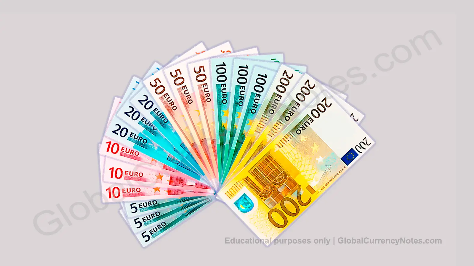
The euro demonstrates a systematic approach to color selection. Seven denominations use seven distinct colors positioned across the color spectrum to maximize visual distinction: grey (€5), red (€10), blue (€20), orange (€50), green (€100), yellow-green (€200), and yellow-brown (€500, discontinued). This spectrum-based approach minimizes confusion and aids rapid recognition.
Regional patterns also appear in color selection. Many Commonwealth countries using pounds or dollars show similarities in their color schemes, reflecting historical connections and shared design traditions. Asian currencies often incorporate red more prominently due to cultural associations, while European currencies tend toward blues and greens.
Color Durability and Practical Considerations
Banknote substrate materials significantly affect color durability and appearance. Traditional cotton-paper notes absorb ink differently than modern polymer notes, influencing both initial color vibrancy and long-term color retention through circulation.
Polymer banknotes, used by over 40 countries including Australia, Canada, and the United Kingdom for some or all denominations, allow for more vibrant and durable colors compared to cotton-paper notes according to central bank reports. The plastic substrate holds ink more consistently and resists fading better than traditional paper materials, extending currency lifespan.
According to the Reserve Bank of Australia, polymer notes maintain their color quality approximately 2.5 times longer than equivalent paper notes. This durability factor influences color choices, allowing designers to use lighter shades that would show excessive wear on paper currency, while maintaining appearance standards throughout circulation life.
Color Changes in Currency Redesigns
Central banks occasionally change banknote colors during redesigns, though such changes require careful public education campaigns. In 2016, Switzerland changed its 20-franc note from blue to red after public confusion with the blue 100-franc note. This example demonstrates how color associations become deeply ingrained in user behavior and require thoughtful management during transitions.
The euro redesign between First Series and Europa Series maintained core color schemes while introducing new shades and more vibrant tones. The ECB recognized that radical color changes would disrupt the quick-recognition system users had learned over years of use, potentially slowing transactions and increasing errors during transition periods.
When the United Kingdom transitioned to polymer notes beginning in 2016, designers preserved the traditional color schemes despite the new substrate material. The £5 remained blue, the £10 orange-brown, and the £20 purple, ensuring continuity for users while upgrading security and durability through polymer technology.
Frequently Asked Questions About Banknote Colors
Why are US dollars all green?
US dollars maintain their green color due to historical precedent dating to the 1860s. Green ink was readily available, difficult to photograph for counterfeiting purposes using period technology, and became culturally associated with American currency strength and stability. While subtle color variations were added after 2003 for enhanced security features, the dominant green remains unchanged to preserve the «greenback» identity that distinguishes US currency internationally. However, this monochrome approach has faced criticism regarding accessibility for visually impaired individuals.
Do all countries use different colors for different denominations?
No. The United States and Switzerland are notable exceptions that use the same basic color across most or all denominations. However, over 95% of countries worldwide employ distinct colors for different denominations as a primary identification method according to available surveys. This global pattern reflects widespread recognition that color differentiation aids transaction speed and reduces errors, though design philosophies and historical precedents vary by monetary authority.
How does colorblindness affect banknote recognition?
Approximately 8% of men and 0.4% of women have red-green colorblindness according to vision research, making certain color combinations difficult or impossible to distinguish. Modern currencies address this through multiple strategies including size variation between denominations, raised printing for tactile identification, and strategic color choices that remain distinguishable even with common color vision deficiencies. Blue tones remain reliably visible to people with red-green colorblindness, making them popular choices for key denominations. However, colorblind individuals may still face challenges with some currency systems.
What is the most common banknote color globally?
Green is the most common banknote color worldwide, appearing in approximately 23% of all denominations according to available currency surveys. This includes US dollars, which dominate global circulation and reserve holdings. Yellow follows at approximately 18%, grey at 17%, and blue at 14% based on survey data. Purple and violet are least common, appearing in only about 10% of banknotes globally, often reserved for highest denominations. However, these percentages represent approximations based on available data and may vary based on methodology.
Can banknote colors fade over time?
Yes, banknote colors can fade through circulation, particularly when exposed to sunlight, moisture, and repeated handling over extended periods. Polymer notes resist fading approximately 2.5 times better than paper notes according to central bank durability studies. Central banks monitor color degradation through automated sorting systems and withdraw heavily worn notes from circulation to maintain currency quality and authenticity verification reliability. Fading can also indicate counterfeit notes printed with inferior inks.
Why do euro notes use such distinct colors?
The euro uses seven distinct colors (grey, red, blue, orange, green, yellow-green, yellow-brown) positioned across the color spectrum to maximize visual distinction between denominations. This design helps users quickly identify values even in poor lighting conditions or when handling notes rapidly during transactions. The systematic approach minimizes confusion across diverse populations using the currency and accommodates users with various levels of color perception ability. The European Central Bank designed this system considering both accessibility and security requirements.
Are there accessibility standards for banknote colors?
While no universal international standard mandates specific banknote colors, many countries follow guidelines developed by organizations like the International Organization for Standardization (ISO) and national accessibility councils. These recommendations include size variation between denominations, high-contrast colors that work with common colorblindness types, raised printing for tactile identification, and color choices that accommodate common forms of color vision deficiency. However, implementation varies significantly by country based on local regulations, design traditions, and accessibility priorities. Standards continue to evolve as understanding of accessibility needs improves.
Disclaimer: Information provided is for educational purposes only and does not constitute professional advice. Banknote standards and regulations vary by jurisdiction and are subject to change. Readers should exercise their own judgment. For full legal disclosures and liability limitations, visit our Legal Notice.